
Different time scales can create significantly different perspectives with broader understanding.

While a histogram is useful to present a frequency distribution organized into buckets(bins) and quickly shows in this example how almost 80% (23/31) of daily transit counts occur below a value of 50, a box chart offers more specific metrics and a better understanding of outliers, and a violin chart shows the full distribution vs the summary form of a box chart. The wider sections of a violin plot represent a higher probability that members of the population will take on the given value, more narrow sections represent a lower probability.
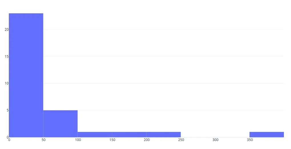
Frequency Histogram
The original cumulative transit count shown in turquoise with the addition of a bar chart in red displaying daily totals. From this chart we see the total for the month, dates of key events, and a qualitative sense of activity each week.
Collecting additional data over months and years will provide a seasonal baseline and comparative data to measure change. With the development of an operations baseline, key performance indicators (KPI’s) may be introduced as a guide to evaluate future data. Year-to-year, month-to-month, event-to-event comparisons can be considered in context of change initiatives to improve results.
Additional data will also provide the opportunity to create mirror histograms and mirror bar charts for comparison.