
Depth is important when considering a process, guide, or template. For a small project, this form may be useful to facilitate a conversation on the key points of purpose, scope, timeline, stakeholders, and desired results. For a more complex undertaking, taking time to document and build a shared understanding is invaluable. This template is somewhat broader with the inclusion of attributes of Logical Framework Analysis and Uncertainty (Design Thinking).

Information can be presented and digested in many forms including at-a-glance, perhaps one level of abstraction above a dashboard.
Enchanted Objects is the title of a terrific book by David Rose, Simon & Schuster.
Two years ago I attended a conference in the Seaport District where David presented his ideas, and ever since I've been seeking a use-case and matching technology to explore. He speaks of the ability of enchanted objects help us make decisions with just the right amount of information and make the best choice. They can indicate that current data is worthy of attention; speed is a core attribute, we can respond to this type of information very rapidly.
I recently purchased an LIFX WIFI bulb. A really nice product, vivid colors-the pink is increadible, and excellent customer support. A configurable and easily integrated enchanted object.

For an initial experience, I established set of CO2 ranges mapped to different colors for my office, and throughout the day the bulb color changes depending on the concentration level provided by a Smart Module sensor. I've set the brightness level at 10% and located the bulb in a short lamp without shade next to my PC display.
It now operates as a background indicator illustrating environmental change real-time creating a deeper sense of my work space. For example, after a post-lunch walk, a higher breathing rate results in a much sharper response and peak color levels faster than typically seen during morning hours.
Many other possible use-cases are possible and worthy of exploration.
An example of a Finite State Machine model of a simple function to help visualize and validate logic and timing against code before testing, ideally minimizing debugging time and effort.

All gas molecules vibrate and rotate at particular frequencies. These natural frequencies cause asymmetric molecules to absorb light at very specific wavelengths. CO2 is an excellent example of a symmetrical molecule having non-symmetrical and symmetrical modes of vibration and hence it absorbs IR. Carbon dioxide uniquely absorbs light at wavelengths of 3.95 µm and 4.26 µm.
When IR is incident on a gas, the energy states of atoms vibrating in the molecules change in discrete steps when the wavelength of the infrared matches the molecules natural frequencies. The extent of absorption depends on the absolute number of CO2-molecules between IR source and detector. The detector has an optical band-pass filter that eliminates all frequencies except the wavelength that the CO2 gas molecules can absorb.

NDIR Sensor Diagram.
As IR-absorbent CO2 enters the sensor, the IR intensity received by the detector will decrease according to a exponential relationship called the Beer-Lambert Law:
I = Io exp(- K *L* C)
(I is the CO2 intensity, Io is the intensity in nitrogen, K is a factor dependent on gas absorption lines and filter bandwidth, L is the optical path-length between IR lamp and detector, C is the concentration of CO2)
R&D for NDIR gas measurement started during the late 1930’s in the U.S. as a classified Defense Department program. Low-cost NDIR CO2 sensors are a relatively recently development.
Remarkably consistent peak UV readings (green) during periods of clear sky in contrast to a dramatic difference in measured cumulative average LUX per hour. The bulk of the energy received occurred during the morning both days.
The morning of the 14th was bright and clear with some clouds in the afternoon.
The 15th was fairly overcast with the exception of a narrow mid-morning window of sun trying to break through the clouds.

For the top chart, the green trace is interior measured UVI, the orange trace is an outside clear-sky model for UVI. The interior UV sensor was positioned normal to the peak sunlight.
Enriching dashboard information value via REST API microservices; in this example, integrating local outside environmental NWS JSON data.

A snippit of data from the weather.gov API.
Min-Max relative humidity from summer into fall, interior climate example.
Straight-line section due to travel during period of high humidity with module off-line for majority of time (very limited WIFI).
In addition to a robust IDE for application development & testing, a high-caliber API Development Environment (ADE) is essential.
Postman provides a full-life cycle ADE solution including availability and performance monitoring. This example demonstrates a live module API test to retrieve a variable value.

Adding a new module feature with RFI filtering on a separate board.

Attending IOT conference with good content on sensors, cloud integration solutions, wireless technologies, development tools, and more.

Just arrived! This is a result of extensive research into the optical characteristics of a wide range of plastics, and search for suppliers of very specialized materials.

Laser cut for precision fit. The folks at Astra Products are great to work with!
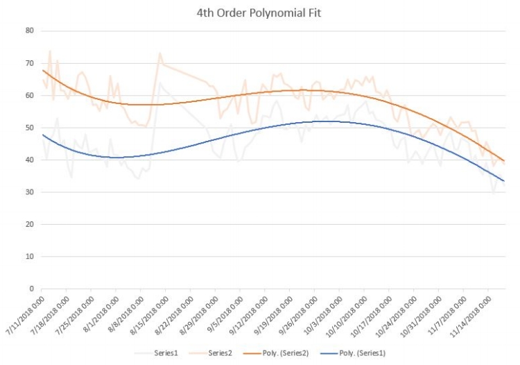
The Box chart provides a valuable quick look at distributions (available starting in the 2016 release of Excel).
We can quickly assess the range (max-min) and see that 75% of the readings during this period fall below approximately 700ppm much faster that interpreting a multi-day line graph.

The human visual system is best suited to judge position and length. Bar charts, histograms, box charts, and similar visualizations are superior to pie and donut charts because of the difficulty we have quantifying angles.
After triggering an alert or event based on a value-duration threshold, it is also possible to provide notification that a metric has returned to a normal range.

Amazing! “The Fairbanks House in Dedham, MA is the oldest known wood structure still standing in North America.”
“It may be said quite simply that no other house of the mid-17th century in New England has survived in such unbelievably unspoiled condition. It is also extraordinary that so early a structure should preserve such a high percentage of original features. It is a veritable storehouse of information concerning the small handful of houses which survive from this early period.”
~ Abbott Lowell Cummings, Professor Emeritus American Art, Yale University ~
QLIK is a modern analysis tool with a unique set of association capabilities including the Insight Advisor function which can offer helpful analysis suggestions and ideas to pursue further.
In this simple example, two mutually independent climate metrics, average-per-day, are plotted on a scatter plot diagram. This presentation may be of more interest with a longer sample period and a third variable represented by size, perhaps T, RH, and CO2(size) as a visitor-staff comfort index.

Collected data can be downloaded for deeper analysis. Data collected from modules can be downloaded, or data after processing through synthetic variables can also be downloaded. In this simple example, the Excel Analysis ToolPak is utilized to produce a histogram that provides a quick, at-a-glance, presentation of climate data indicating a healthy distribution.

Options/Add-ins/Excel Add-ins/Analysis ToolPak & Solver.
This year has seen a very humid summer (note earlier August 31st Dew Point post) and now continuing well into September (The outside relative humidity is currently 93% at 6PM tonight as I write this post!)
This article by the NPS has some very practical suggestions. For example:
“For a quick test to determine if a damp basement is caused by saturated walls or is a result of condensation, tape a piece of foil onto a masonry surface and check it after a day or two; if moisture has developed behind the foil, then it is coming from the masonry. If condensation is on the surface of the foil, then moisture is from the air.”
https://www.nps.gov/tps/how-to-preserve/briefs/39-control-unwanted-moisture.htm#indentifydamage
A worthwhile read with valuable thoughts to consider in preparation for the fall, winter, and next year.
I came across this today. I have not had a chance to try it, but if it works as advertised it could be of great value for historic properties where avoiding exploratory, repair, or conservation damage is paramount.

Perhaps useful to uncover more detail on construction and building history than could otherwise be determined?
By combining multiple capabilities, raw data can be processed and displayed in an effective format that provides valuable at-a-glance information.
- Starting with raw sensor data
- Passing the raw data through a smoothing filter
- Utilizing a synthetic variable to organize this data into1 hour units
- And selecting a bar graph that shows values by hour in a clear presentation
- Dashboard viewers can quickly assess if conditions are within an expected daily range or not.

This data can be summed by day provide a total exposure by day graph, and/or multiplied to calculate weekly, monthly, annual rates.
So far for the year we've recorded 473 hours where dewpoints were ≥ 70°. As far as records that we know of, the most number of hours prior was 395 back in 1988. 473 hours of swimming through the air.

The chart shows the potential for dramatic change from year to year. On going monitoring of the response of interior climate conditions to seasonal change can help organizations adapt and make the best decisions for their collections.